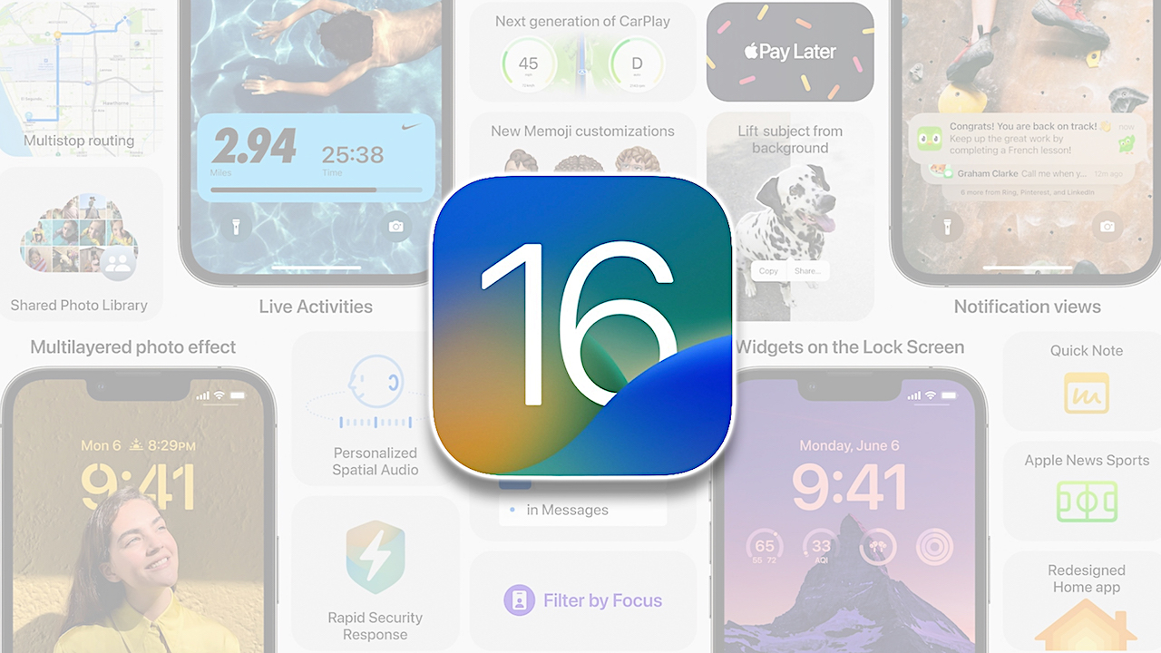
Apple iOS 16 In Depth Review: Refined New Features
This new version of iOS 16is filled with improvements and changes to practically every app and screen on the iPhone.
The story of iOS 16 is all the things that your phone does when you’re not using it. Apple’s trying to turn your phone into more than just a bunch of apps.
Apple has been saying for years that we need a reset in our relationship and the way we use technology for the better.
Ironically, Apple is probably the company most to blame for the overuse of tech problem.
Therefore, part of the idea with its new smartphone software is that there might be ways for your smartphone to be useful without you having to use it so much.
iOS is an excellent, mature piece of software, and Apple’s clearly not looking for an excuse to reinvent the wheel anymore.
This year, Apple found a part of its software that hasn’t gotten much attention recently and gave it a makeover.
The iPhone lock screen is the true star of iOS 16.
Apple has reconceived its purpose altogether, shifting it from just a clock and a bunch of notifications to something much more like a second homescreen.
Lock screen widgets are an instant upgrade. You can now see your calendar without unlocking your phone or even swiping right to get to that page of widgets everyone always forgets about.
You can have a tiny widget that launches a new note in your notes app or a widget that comes from the habit tracking app Streaks to keep track of your daily goals and remind you of them.
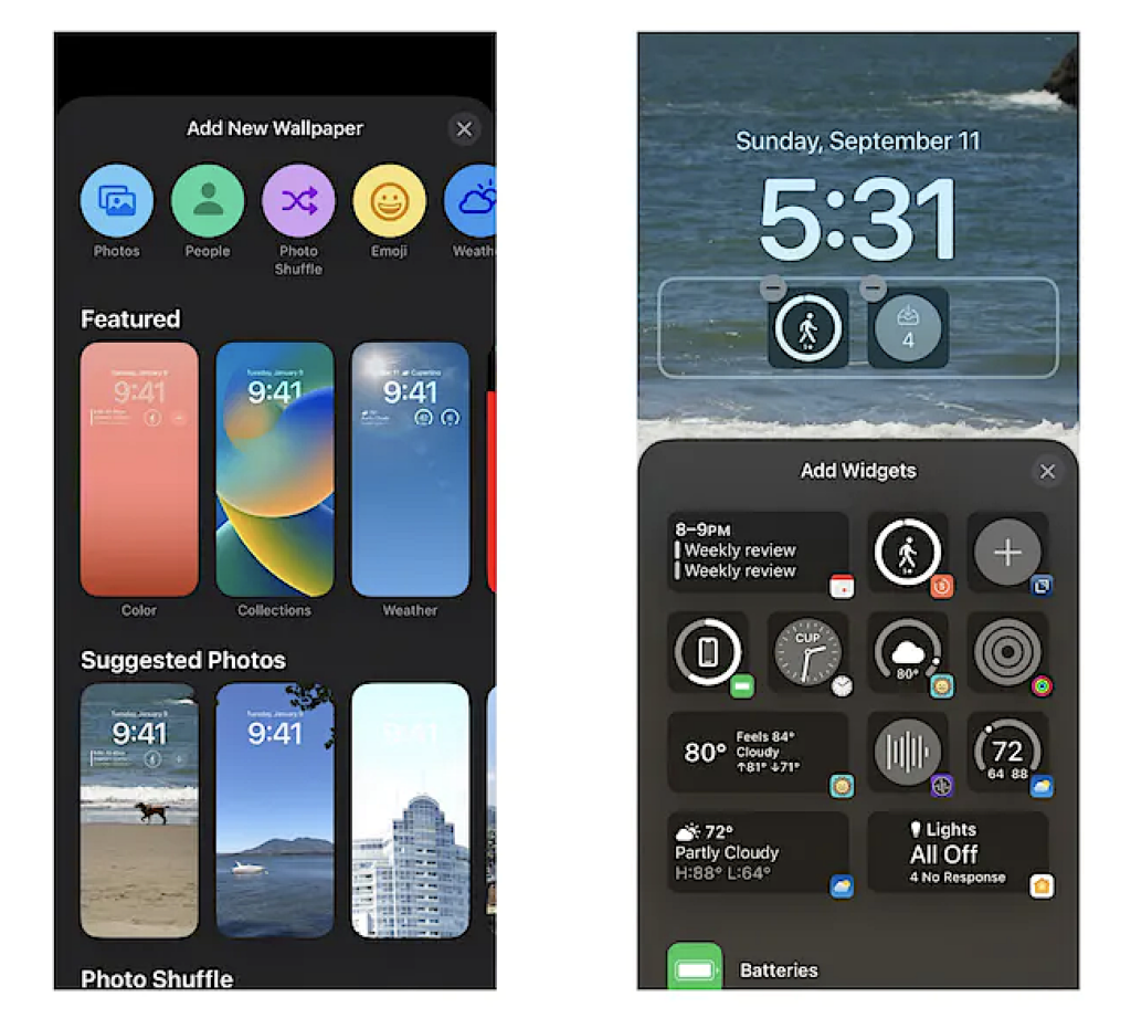
The iPhone has never been good at these kinds of light-touch interactions. Before iOS 16, most things required you to pick up your phone, unlock it, swipe to the right homescreen, and open an app.
Apple has tried to shrink that process through Siri voice commands, and part of the Apple Watch’s whole appeal is easier access to simple tasks. But “put a bunch of them on your lock screen” might be Apple’s best solution yet.
When you pair it with the always-on displays on the iPhone 14 Pro, the iPhone becomes a fountain of useful information without requiring a single tap.
Apple hasn’t quite finished the job here. For one thing, these widgets are still irritatingly noninteractive; they can update with new information, but the only way to use them is to tap on them to open their app.
Why can’t I long-press the Calendar widget to see my whole day? Why can’t I tap on the “drink water” Streaks widget to actually log my water consumption?
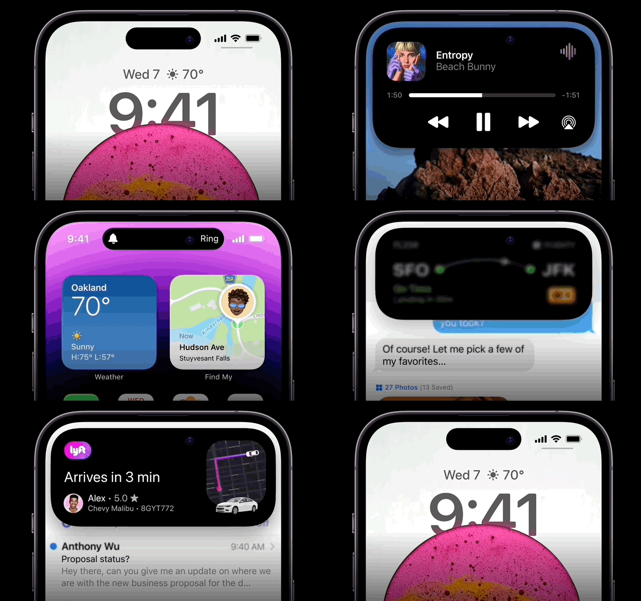
The new Dynamic Island on the iPhone 14 Pro is a slight improvement in this sense, at least while you’re actively using the phone: you see a tiny sliver of information in the pill at the top of the screen, and you can tap it to open the app or long-press to expand to the full widget.
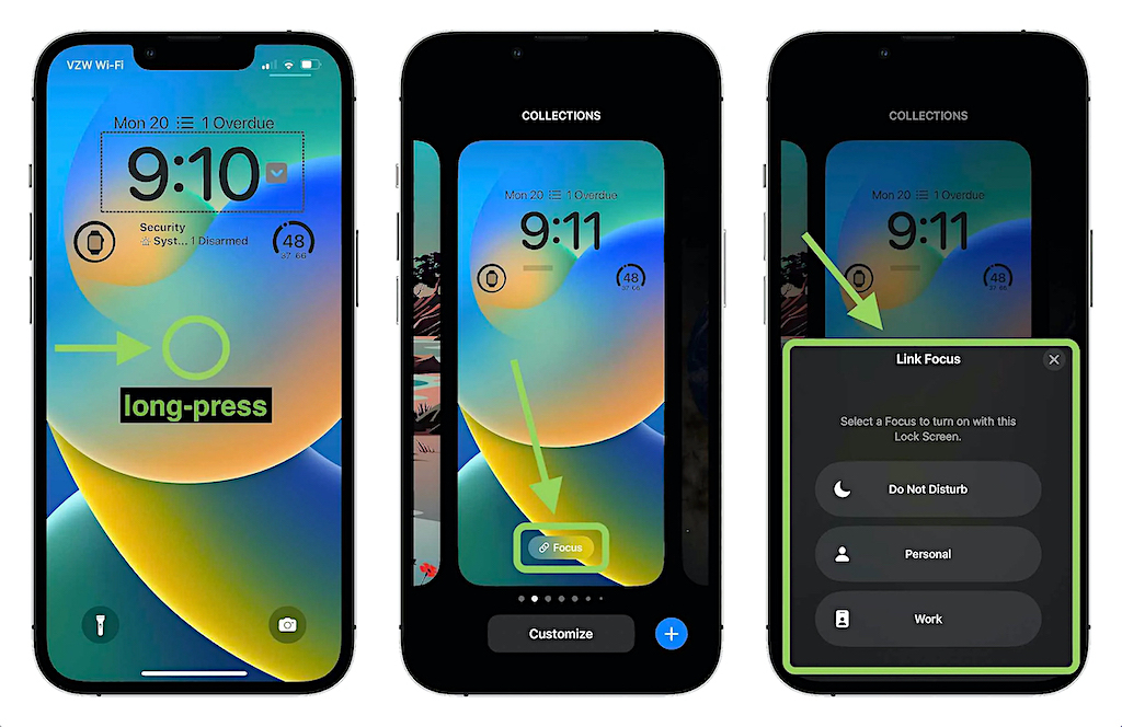
With iOS 16, lock screens are also a way to change Focus modes, which is extremely clever. Getting all this set up is a fair amount of work andseem to require an advanced degree to set up correctly.
You have to pick backgrounds, choose font colors for the clock, add lock screen widgets for each one, and then go through the Focus rigamarole over and over again, but it’s worth it to be able to swipe through all of your phone’s various modes.
It’s a long-running and extremely true joke that two-thirds of Apple’s new iOS features every year are just Android features from six years ago. Much of the other third is Apple taking features from third-party apps and baking them into the operating system itself.
Outside of Apple occasionally pretending it invented decade-old software tricks, this is the right strategy: most users don’t want to download tons of apps or learn new things, and the more functional the iPhone is out of the box, the better it’ll be for most people.
There’s one place where Apple does things no other manufacturer or OS can match, and that’s the camera. With iOS 16, you get Live Text in video, which means you can snap some footage, then pause the playback (it doesn’t work while you’re recording), and press and hold on some text to copy it.
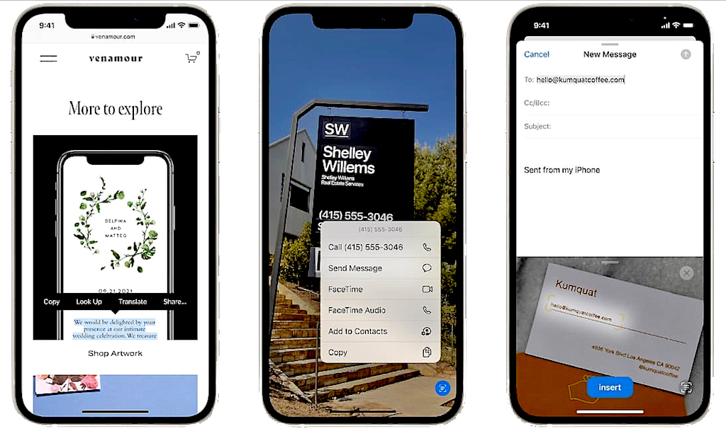
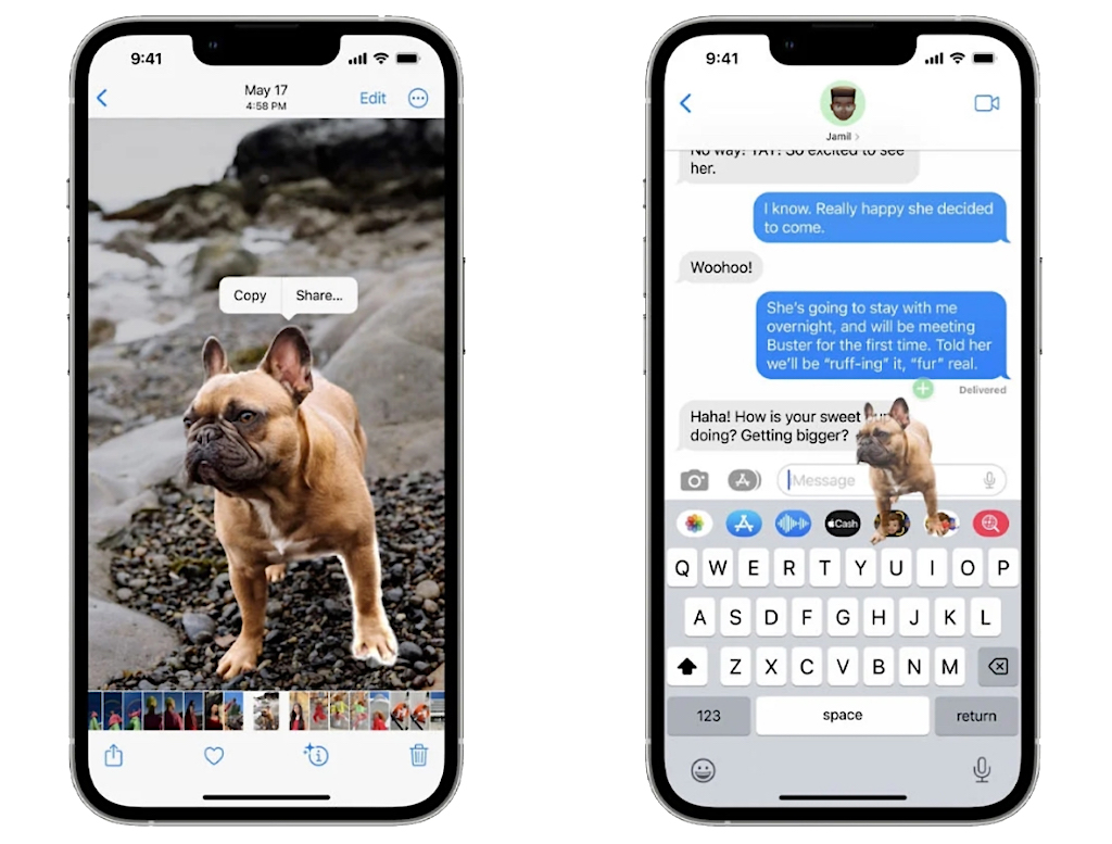
It’s not perfect, it’ll occasionally think “organic” is spelled “WACIGINIC” but it’s good enough to be useful. The feature that can automatically grab the subject, so long as it’s human or animal, out of a photo so you can paste it or save it somewhere else.
Beyond that, iOS 16 is chock-full of semi-obvious features, that feel like Apple could and should have added a long time ago.
Undo Send and scheduled messages in Mail is an obvious one, practically every other email service and app has offered those features for years, but they work well enough in Mail now. Maps, can also now do multiple stops in a single trip.
With iOS 16 comes a handful of new accessibility features, including a really impressive system-wide closed captioning feature and some clever real-time image recognition.
TheiOS 16 update offers haptic feedback while typing, haptics that will allow you to feel vibrations as you type. It’s a good substitute for keyboard clicks without announcing to the room that you’re typing a text message.
You can also now mark conversations unread in Messages so you can go back and respond to it later. If you use Apple’s hidden Filter Unknown Senders feature, you can even filter to just see your unread messages.
In Messages, you can also now unsend and edit a message. If you and your recipient both use iOS 16, it works seamlessly: the text changes in place, with a small blue “Edited” symbol underneath that you can tap to see all versions of the message. (You can edit up to five times and up to 15 minutes after you first sent it.)
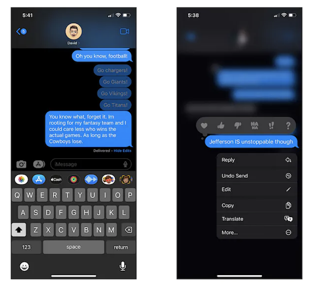
The unsend feature, meanwhile, only works iMessage to iMessage; there’s no retrieving that text you sent an Android friend.
As phones have gotten bigger, Apple’s started shifting its UI emphasis down toward the bottom of the screen.
The URL bar in Safari, the Spotlight search bar, and all sorts of other tappable UI fields have been moved down to save your stretchy thumbs.
Features like this make up the bulk of iOS 16, and there are a lot of them. (Apple’s full change log is hilariously long.) In all, the changes do make the phone noticeably more functional and easier to use.
Even in the early betas, iOS 16 was more stable than most new software, which says something not only about Apple’s capabilities but also about how much it’s really writing from scratch here.
As ever, though, third-party developers will be the ones who decide whether iOS 16 is a roaring success or just another iterative update. If you mostly use third-party apps, you might not notice much about this year’s new OS.
Hopefully developers and sites will also quickly adopt passkeys, the new password-free authentication system that iOS 16 supports.
Right now, you can hardly use passkeys anywhere, but practically the whole industry is behind the idea.Your iPhone or other devices (because passkeys aren’t an Apple-only thing) will become the key to your security.
Apple is clearly invested in turning the iPhone into more than just a collection of apps; it wants the phone to be lively and interactive.


